Project / Case study
PropAlly
A trading-focused web platform designed to help users compare prop firms, explore offers, and evaluate trading conditions in one place. PropAlly combines structured comparison UX with a bold, high-contrast visual system across desktop and mobile.
View full case ↗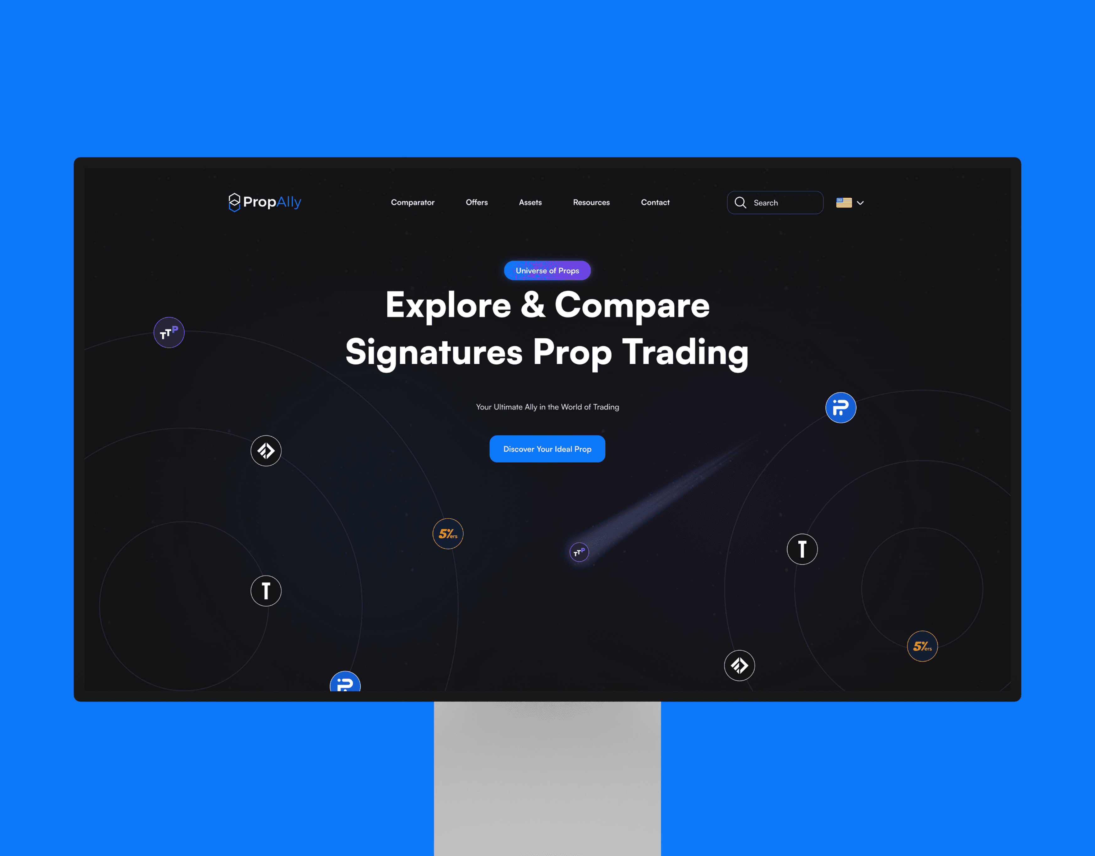

The Background
PropAlly was built for traders navigating a fragmented prop trading landscape. The platform brings together firm comparison, offer discovery, and key decision-making information in one place, reducing the need to search across multiple websites.
The Challenge
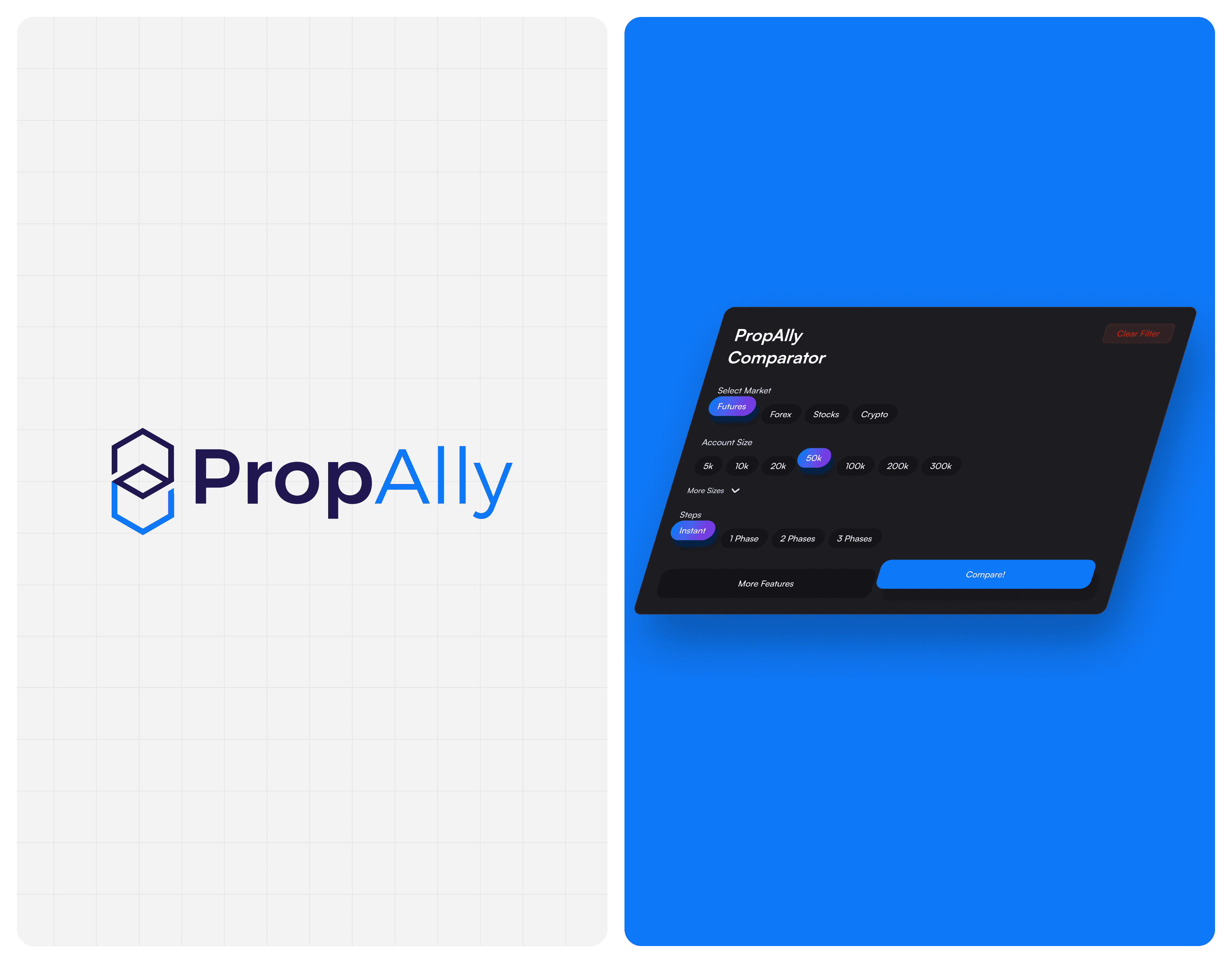
The main challenge was designing for data-heavy comparison without overwhelming users. Traders need to evaluate multiple firms quickly, so the experience had to balance dense information, fast filtering, and clear visual hierarchy across desktop and mobile.
The Solution
I designed PropAlly as a responsive comparison platform with tailored filters, structured data tables, and a distinctive dark visual identity. The result is a clearer, faster experience that helps users compare prop firms, understand offers, and make more informed decisions.